
Groovy Vibe
“A retroesque serif paying homage to the most chill of vibes.” Quoting myself there, but this was something new to me. I had studied letterforms, I had type foundries that I referenced, but I had yet to learn the ins and outs of making a typeface digitally.
In this project, I aimed to better understand type anatomy and the consistencies that solidify a font.
Presentation
To show the fullness of the typeface I made, even if it be incomplete in characters, I have this to show the font in action.


Typeface Poster

As I made this typographic poster I had a context in the forefront of my mind – which is what led my design decisions for this layout. With a typeface meant to look retro, 70s in essence, my mind immediately went to album covers of the era and vinyl sleeves.
Process
As a precursor to my work, I cast a wide net in my research of display faces. I knew from the beginning I wanted a serif with a decently high x-height, but it was this exploration that helped me rein in the idea.
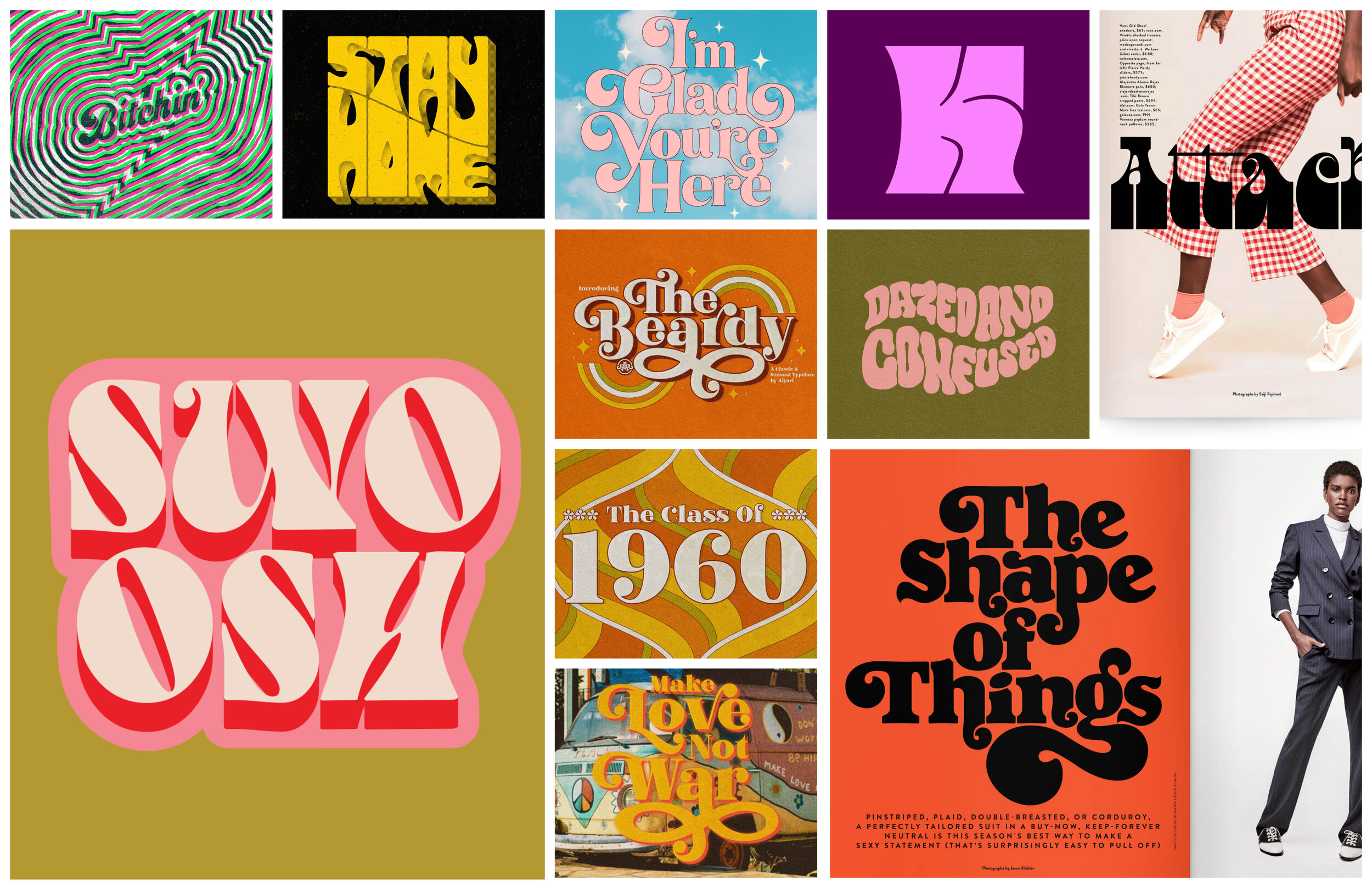
Research
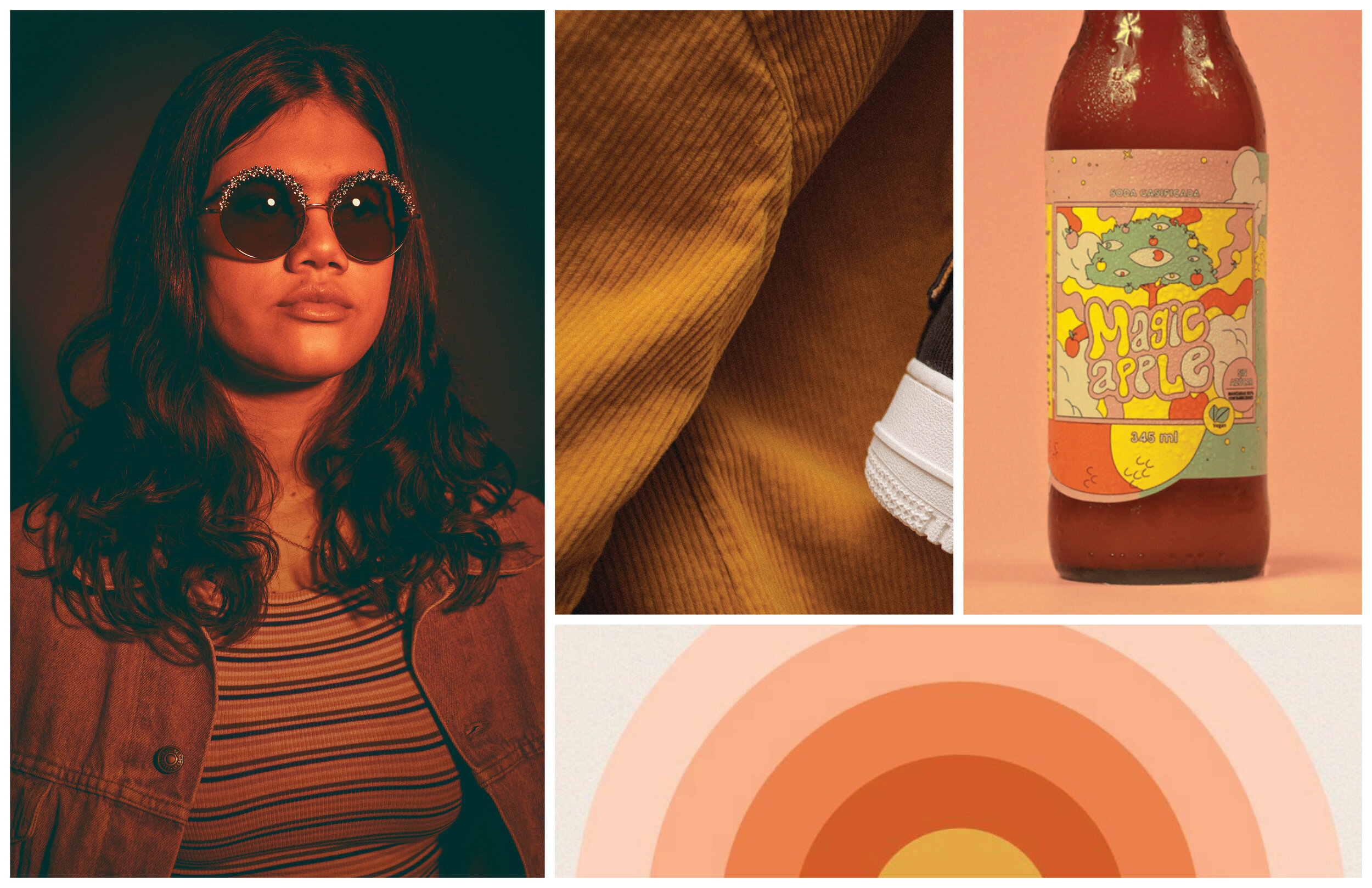
Moodboard